Navigation
Install the app
How to install the app on iOS
Follow along with the video below to see how to install our site as a web app on your home screen.
Note: This feature may not be available in some browsers.
More options
You are using an out of date browser. It may not display this or other websites correctly.
You should upgrade or use an alternative browser.
You should upgrade or use an alternative browser.
The Color Of Classics
- Thread starter Harry
- Start date
- Status
- Not open for further replies.
Captain Bacardi
Well-Known Member
Looks purple to me. 
Capt. Bacardi

Capt. Bacardi
I'd say purple, but...it's not a pure purple, as it leans more toward blue. If it were any more blue, it would be called "royal blue" (which was a deep blue with a hint of purple to it).
In scans and photographs, the color often does not reproduce correctly. It could be that some have never seen a real one in person before... That and even printing was never an exact science, so there could be variations between printing runs on those.
In scans and photographs, the color often does not reproduce correctly. It could be that some have never seen a real one in person before...
 That and even printing was never an exact science, so there could be variations between printing runs on those.
I've always thought of it as "bluish purple" if that makes any sense!
It is a difficult color to reproduce either with printing presses or scanning or photographs. If you look at a bunch of the scans all on the same page from say, Amazon, they all look like slightly different shades, some actually approaching more blue than purple.
Harry
Harry
Part of the problem in the computer age are the screens that they are viewed on. My calibrated Triniton CRT monitor (yes, I use a tube) blows the accuracy of LCD screens out of the water; I have yet to see an LCD that doesn't put a color cast of some sort on photos. (And yes, even the expen$ive ones.) Thing is, maybe 0.00001% of users even bother to calibrate a monitor, and I'm betting even fewer can do it correctly. (I can get close, but I'm still not happy that I can get it as close to 100% as I can.)
So, someone scanning in a cover may make the color on their monitor match the scan of their CD, but that is no guarantee it will be even anywhere close to correct Even my attempts at creating the classic "A&M tan" color have been all over the place, since there is such variation in monitor colors. (It has a pinkish cast on some LCD monitors I've used, for example.)
So, someone scanning in a cover may make the color on their monitor match the scan of their CD, but that is no guarantee it will be even anywhere close to correct Even my attempts at creating the classic "A&M tan" color have been all over the place, since there is such variation in monitor colors. (It has a pinkish cast on some LCD monitors I've used, for example.)
Some are blue and some are purple to my eyes. That bothered me at the time, my thinking being "why the heck can't they keep production consistent?" But as I look at them on my shelf I have to say the series started blue (my copy of Vol 1 is clearly blue as are the other early ones) but later releases were clearly purple.
Some are blue and some are purple to my eyes. That bothered me at the time, my thinking being "why the heck can't they keep production consistent?" But as I look at them on my shelf I have to say the series started blue (my copy of Vol 1 is clearly blue as are the other early ones) but later releases were clearly purple.
Not only are blue and purple difficult to distinguish by the human eye sometimes, that range of the color spectrum tends to present problems on LCD monitors, which is what most of us are using these days. Go to this page and scroll down to the full purple image:
http://www.lagom.nl/lcd-test/viewing_angle.php
If your LCD has a problem with viewing angles, most do, you'll likely see a bluish color at the top and a purple color at the bottom - and if you move your head up and down, the colors will change. Scrolling further down you'll other pure-color screens, which probably won't vary as much if you move up and down.
Now, if you have an old CRT (Hi, Rudy!), your purple should be quite pure.
Harry
This is an older discussion on color and perception. Yesterday I was introduced to this online color acuity test:
http://www.xrite.com/custom_page.aspx?pageid=77&lang=en
My final score after one time through it was 21, with most of my deficiency in the blue-green area.
Harry
http://www.xrite.com/custom_page.aspx?pageid=77&lang=en
My final score after one time through it was 21, with most of my deficiency in the blue-green area.
Harry
Nathan Strum
Well-Known Member
This is an older discussion on color and perception. Yesterday I was introduced to this online color acuity test:
http://www.xrite.com/custom_page.aspx?pageid=77&lang=en
My final score after one time through it was 21, with most of my deficiency in the blue-green area.
Harry
I got a 3. My misses were all right next to each other in the green. Not bad.
Surprisingly my LED monitor doesn't have that nasty color cast to it. Brightness? Sure, it falls off if you're at a greater angle, but it is quite different from my laptop, which does odd things to the color and brightness if you do not look at it straight-on. I will say that it's easier to get truer colors with this monitor once it is calibrated.
I need to try that color acuity test. Thing is, I have enough eyesight issues right now, I don't need to find more.
I need to try that color acuity test. Thing is, I have enough eyesight issues right now, I don't need to find more.

I just tried it. Got a 23. It said the best in my age group was a zero which surprised me (50-59 being my age group). I need to wait a while and try it again I guess.
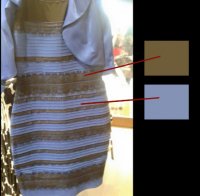
I wasn't aware of the issue until a coworker showed me the picture below, which, utilizing the Photoshop color picker, as demonstrated, was clearly white and gold.

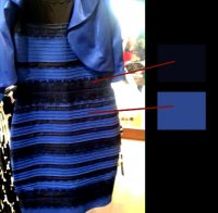
Then my wife argued about it and showed me THIS picture, (again, utilizing the Photoshop color picker) which is clearly black and blue...

So the problem is obviously one of white balance between the original and others who have posted, re-posted etc, with the light under which it is viewed also playing a small role in how we "see' the colors...

Then my wife argued about it and showed me THIS picture, (again, utilizing the Photoshop color picker) which is clearly black and blue...

So the problem is obviously one of white balance between the original and others who have posted, re-posted etc, with the light under which it is viewed also playing a small role in how we "see' the colors...
Well look at the colors in the background. Clearly the picture has just been darkened which accentuates different colors of the spectrum. In the lower picture, you can clearly see that the "black" areas are really gold. (Look near the top especially.) And in the top photo, you can clearly see a blue cast in some of the "white" areas.
I always suspected that it was just two different versions of the photo circulating and causing all the confusion, and the above post proves it. Thanks, Mr. Bill!
I always suspected that it was just two different versions of the photo circulating and causing all the confusion, and the above post proves it. Thanks, Mr. Bill!
The top photo of the dress was the first and original that was circulated. THAT's the one that people see differently - indeed, I see it differently depending on time of day and surrounding lighting levels.

When the debate started, people began using Photoshop to change the white or black levels, and to use color pickers to prove their points - none of which really matter. Just looking at the pic I re-posted, what colors do YOU see in the dress? As I look at it now, in the early-morning foggy light, I see blue and a blown-out black that looks brownish, so as a way of identifying the dress colors, I'd *judge* it to be blue and black in a bad photo.
[By the way, I split the color discussion off from the Herb Alpert CLASSICS thread and gave it its own. It's in SCOF because it started with the color of the CLASSICS series.]
Harry
My daughter first showed me the dress picture, and it was the second one, clearly blue and black when glanced at. If it were the original photo, then yes, I would have said it was white and gold, but the only one I've seen circulated was the darker one. Anyone could do this with Photoshop (or even with the rudimentary editing tools on a phone or tablet)--find colors that are easily shifted, and change the color balance.
If you want to experience some color shifting, take photos under fluorescent lighting. That gives everything a sickly greenish appearance.
If you want to experience some color shifting, take photos under fluorescent lighting. That gives everything a sickly greenish appearance.
- Status
- Not open for further replies.
Similar discussions
- Article
- Replies
- 0
- Views
- 265
- Replies
- 9
- Views
- 2K


